The Best Colors to Paint Your House in 2025 | New Perspective Painting
The Best Colors to Paint Your House in 2025
Best Colors to Paint your Exterior House in 2024 |
Choosing a classic and timeless exterior and interior paint color for your home is an important decision that can greatly enhance its curb appeal and overall aesthetic. Here are some tips to help you select the perfect color:
Top 7 Important Tips When Choosing an Exterior Paint Color
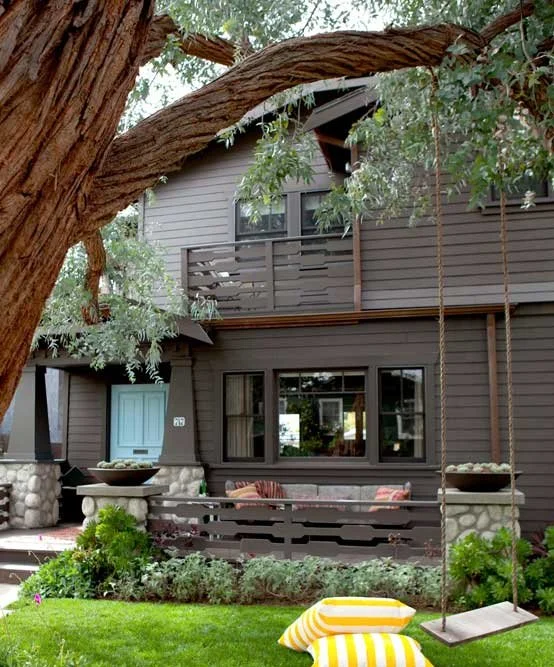
Consider the Architecture: Take cues from the architectural style of your home. Different architectural styles have traditional color palettes that complement their design features. For example, Victorian homes often feature vibrant colors, while Craftsman-style homes typically have earthy tones. Research typical color schemes for your home's architectural style to guide your decision.
Assess the Surroundings: Look at the natural surroundings of your home, including the landscape, neighboring houses, and the overall environment. Your chosen color should harmonize with the surroundings rather than clash with them. Take note of the colors of existing features such as the roof, brickwork, and landscaping elements, as these should complement your paint choice. If you live in a neighborhood that consists largely of stucco houses, then you will want to stick with warm and neutral earth tones.
Consider Climate and Light: Keep in mind the climate of your region and how it might affect the appearance of paint colors. For instance, intense sunlight can cause colors to fade over time, while dark colors can absorb heat, potentially affecting energy efficiency. Test paint samples in different lighting conditions throughout the day to see how they look in various light intensities.
Stick with Neutrals as a Base: Neutral colors like whites, grays, and beiges are timeless and versatile choices for exterior paint. They provide a clean backdrop that can be easily updated with accents or trim colors if desired. Neutral colors also tend to have broad appeal and can increase the resale value of your home.
Test Paint Samples: Before committing to a color, purchase small paint samples and apply them to a discreet area of your home's exterior to see how they look in context. Observe how the color appears in different lighting conditions and at various times of the day. Consider how the color complements other elements of your home, such as the roof, windows, and landscaping.
Accentuate with Trim and Accents: Once you've chosen a base color, consider using complementary trim and accent colors to add visual interest and depth to your home's exterior. This could involve painting doors, shutters, or trim in a contrasting color to create focal points and architectural highlights.
Think Long-Term: While it's essential to choose a color that you love, also consider its long-term appeal. Trendy colors may quickly go out of style, whereas timeless colors will remain classic and attractive for years to come. Opting for a timeless color scheme can save you from frequent repainting and ensure that your home maintains its curb appeal over time.
Our Top Paint Color Picks for Timeless and Elegant Exterior Paint Colors
Benjamin Moore - Iron Mountain
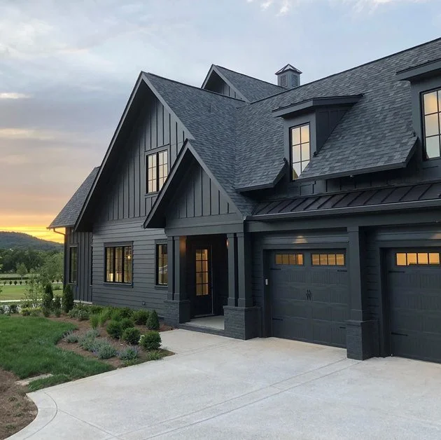
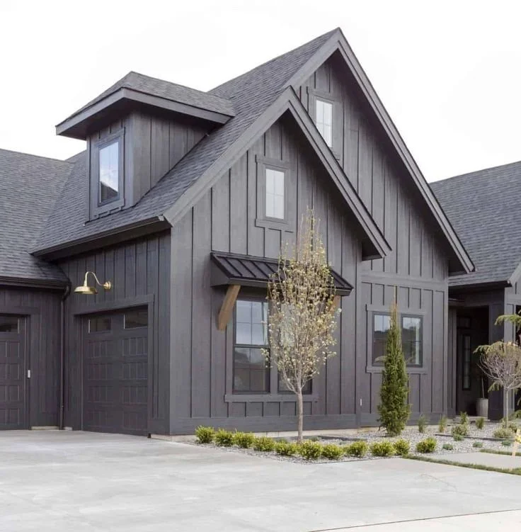
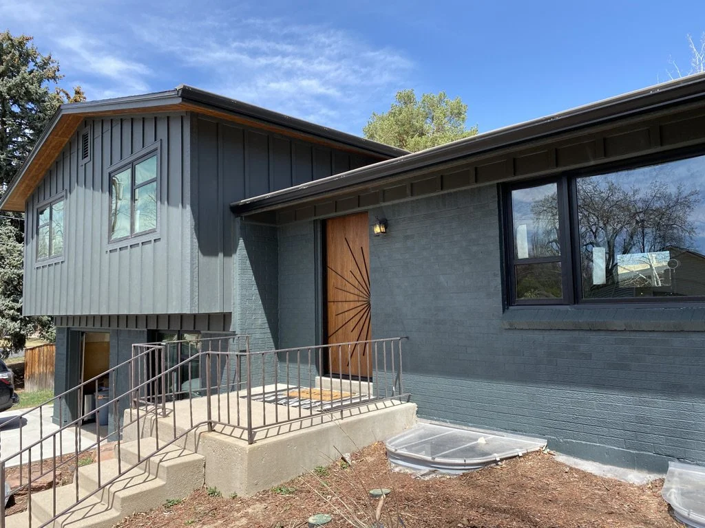
Benjamin Moore Iron Mountain (2134-30) is a deep, rich, and sophisticated charcoal gray with warm undertones. It is a versatile color that can appear almost black in certain lighting, while in brighter spaces, its warm brownish undertones become more apparent, giving it depth and character. This shade works well in both traditional and modern settings, making it a popular choice for accent walls, cabinetry, trim, and even exteriors.
Its timeless appeal pairs beautifully with natural materials like wood, stone, and brick, as well as soft whites, muted neutrals, and earthy tones. Iron Mountain is ideal for creating a bold, moody atmosphere or adding a touch of elegance and drama to any space.
Sherwin Williams - Iron Ore
Sherwin-Williams Iron Ore (SW 7069) is a striking and dramatic deep charcoal color with neutral undertones, leaning slightly cool compared to Benjamin Moore’s Iron Mountain. Iron Ore is often described as an almost-black shade with a softer edge, making it less harsh than a true black but still bold and impactful. It works well in modern, industrial, and farmhouse designs and is a popular choice for exterior accents, interior walls, cabinetry, and doors.
Key Differences Between Iron Ore and Iron Mountain:
Undertones:
Iron Ore: Neutral to slightly cool undertones, giving it a crisp and modern feel.
Iron Mountain: Warm brown undertones, which lend it a softer, cozier, and more traditional look.
Depth:
Iron Ore: Deeper and closer to black, making it more dramatic and bold in darker lighting.
Iron Mountain: Lighter than Iron Ore, with more visible warmth and a softer overall appearance.
Usage and Style:
Iron Ore: Often used for a modern, sleek, or industrial aesthetic. Works great for sharp contrasts.
Iron Mountain: Suitable for creating warm, inviting spaces with an elegant and timeless vibe.
Lighting Effects:
Iron Ore: In bright lighting, it remains a true dark charcoal-gray-black.
Iron Mountain: In bright lighting, its warm brown undertones are more pronounced, making it appear softer.
Both colors are excellent choices, but the decision often depends on the desired aesthetic and lighting in your space. Would you like help deciding which is better suited for a particular project?
Greenblack (6994) by Sherwin-Williams
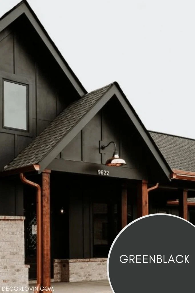
Sherwin-Williams Greenblack (SW 6994) is a deep, rich, and luxurious color that combines the elegance of black with subtle green undertones. It is a near-black hue that adds depth and sophistication to any space while offering a softer, less stark alternative to pure black.
In certain lighting, the green undertones become more noticeable, giving the color a unique richness and versatility. This makes it an excellent choice for those who want a dark and moody look with a bit more complexity. Greenblack works beautifully in modern, industrial, and classic designs, and it pairs well with natural wood tones, crisp whites, and muted greens or earth tones.
Sherwin Williams - Rock Bottom
Sherwin-Williams Rock Bottom (SW 7062) is a This dark green-gray hue is moody and cool. Bring out its mossy undertones by pairing it with Silver Strand or Reserved White. This versatile shade belongs to the dark neutral family, offering a grounding effect to spaces while adding an element of depth and refinement. The green undertones are prominent but tempered by gray, giving the color a muted, organic quality. This balance makes it ideal for achieving a modern, rustic, or even industrial aesthetic, depending on how it's paired with other design elements.
In dim lighting, Rock Bottom appears darker and more subdued, leaning closer to a moody green. In brighter spaces or under natural light, the gray undertones become more apparent, softening the green and providing a sophisticated neutrality. This adaptability makes it suitable for a wide variety of applications, both indoors and out.
Sherwin Williams -Alabaster
Exterior House Paint Color (Sherwin Williams - Alabaster)
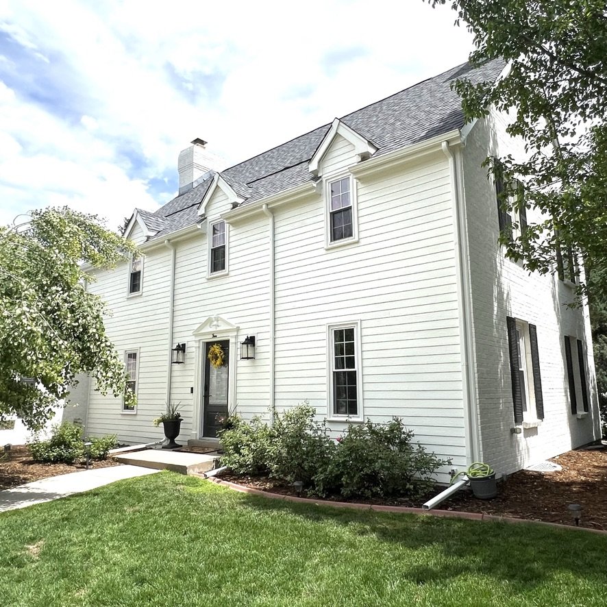
Sherwin Williams Alabaster is widely recognized for its versatility and timeless appeal. This off-white paint color boasts a warm and creamy hue with subtle undertones, evoking a soft and inviting atmosphere without being overly yellow or beige. Its understated elegance makes it suitable for a variety of architectural styles, from traditional to contemporary. Alabaster's warmth and brightness contribute to a cozy yet airy ambiance, reflecting light beautifully to create an open feel in any space. Its seamless coordination with a wide range of colors allows for flexibility in design choices, making it a popular option among interior designers, homeowners, and professionals. Renowned for its timelessness, Alabaster remains a reliable choice that can adapt to evolving design trends while maintaining its classic appeal. Accessible at Sherwin Williams stores nationwide and internationally, Alabaster offers convenience and quality for those seeking to enhance their living spaces with a versatile and enduring paint color.
Sherwin Williams - Alabaster pairs with Sherwin Williams - Urbane Bronze and Sherwin Williams - Iron Ore
Sherwin Williams - Greek Villa
Best Exterior House Paint Color (Sherwin Williams - Greek Villa)
Sherwin Williams Greek Villa is a soft and warm off-white paint color with a touch of yellow undertone. It falls within the creamier spectrum of whites, making it an excellent choice for creating a cozy and inviting atmosphere. Greek Villa has an LRV (Light Reflectance Value) of 83, which means it reflects a good amount of light, contributing to the brightness of a space.
This paint color is part of Sherwin Williams' Neutral Nuance collection, which emphasizes timeless and versatile hues that can adapt to various design styles and preferences. Greek Villa is particularly popular for its ability to evoke the ambiance of Mediterranean-inspired spaces, resembling the sun-kissed walls often found in coastal villas.
While Greek Villa is predominantly used as a wall color, it also works well for trim and accents, especially when paired with deeper shades or contrasting colors to create visual interest. It complements a wide range of decor styles, including traditional, farmhouse, coastal, and transitional, offering flexibility in design choices.
Greek Villa's versatility extends to both interior and exterior applications. Indoors, it can create a serene backdrop for living rooms, bedrooms, kitchens, and bathrooms, while outdoors, it can lend a fresh and inviting look to facades, siding, and trim.
Overall, Sherwin Williams Greek Villa is a timeless and adaptable paint color that adds warmth, brightness, and sophistication to any space, whether used alone or in combination with other hues. Its popularity stems from its ability to create a welcoming ambiance while harmonizing with a variety of design elements and architectural styles.
Sherwin Williams Westhighland White
Sherwin Williams - Westhighland White Exterior Paint Color
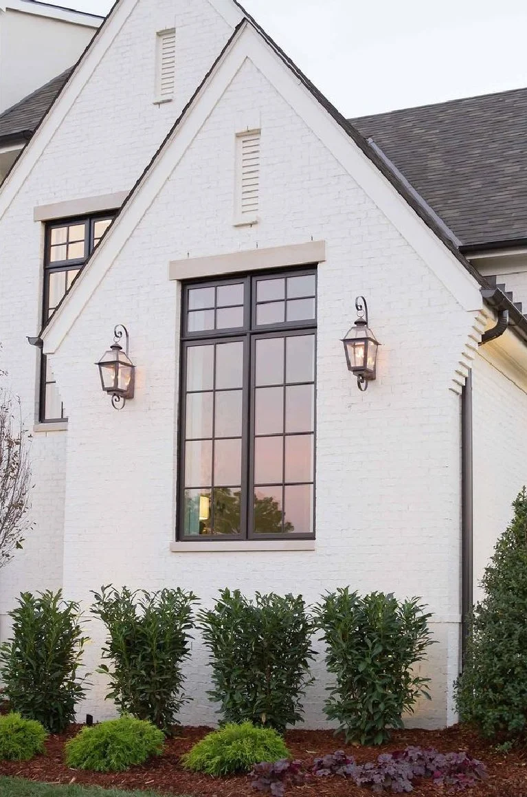
Sherwin Williams Westhighland White is a warm off-white paint color with subtle beige undertones, exuding a soft and inviting ambiance reminiscent of natural linen or warm cream. With a Light Reflectance Value (LRV) of approximately 79, it offers a moderate level of light reflection, ideal for brightening spaces while maintaining a sense of warmth. Its versatility makes it suitable for a variety of design schemes, complementing both warm and cool tones and adapting seamlessly to different decor styles, including traditional, transitional, and contemporary. Whether used on walls, trim, cabinetry, or furniture, Westhighland White adds a timeless and elegant touch to interiors and exteriors alike. When coordinating with other colors, it pairs well with warm neutrals, earthy tones, and rich accents, enhancing the warmth and texture of natural materials like wood and stone. Its popularity among homeowners and designers stems from its ability to create inviting and enduring spaces that exude sophistication and charm. Overall, Westhighland White is a versatile and timeless paint color that brings warmth, elegance, and versatility to any space it graces.
Sherwin Williams' Shoji White
Sherwin Williams - Shoji White Exterior Paint Color
Sherwin Williams' Shoji White stands out as a versatile and highly sought-after paint color renowned for its soft and neutral tones. This shade boasts a delicate balance, offering subtle undertones that lean towards warm greige, evoking a tranquil ambiance reminiscent of traditional Japanese paper screens. With its relatively high Light Reflectance Value (LRV) of around 77, Shoji White reflects ample light, contributing to a bright and airy atmosphere while retaining a sense of warmth and comfort. Its versatility extends across various design styles, from traditional to contemporary, making it a favored choice for interior spaces. Whether applied to walls, trim, or cabinetry, Shoji White effortlessly blends with other elements, fostering a cohesive and harmonious aesthetic. When paired with warm neutrals, soft pastels, or muted earth tones, it exudes a serene and sophisticated allure, enhancing the organic beauty of natural materials like wood and stone. Popular among homeowners and designers alike, Shoji White embodies understated elegance and timeless appeal, offering a serene and inviting backdrop for any living space.
Benjamin Moore - Swiss Coffee
Benjamin Moore - Swiss Coffee Exterior Paint Color
Swiss Coffee is a soft, creamy white with subtle yellow undertones, reminiscent of the warm hues found in freshly brewed coffee with a splash of cream. It exudes a sense of warmth and comfort, creating a cozy and inviting atmosphere.
Undertones: While primarily a neutral white, Swiss Coffee has gentle undertones of yellow or beige, adding depth and warmth to its appearance. These undertones contribute to its versatility and make it suitable for a wide range of design styles and color palettes.
Light Reflectance Value (LRV): Swiss Coffee typically has a moderate LRV, reflecting a good amount of light while still maintaining a sense of warmth and coziness. This makes it suitable for creating bright and airy spaces without feeling stark or cold.
Versatility: Swiss Coffee is highly versatile and complements various design schemes, from traditional to contemporary. Its soft and understated elegance makes it suitable for both interior and exterior applications, including walls, trim, and accents.
Applications: Swiss Coffee can be used effectively as a main wall color, trim color, or for cabinetry and furniture. Its neutral yet warm appearance allows it to blend seamlessly with other colors and materials, creating a cohesive and harmonious look.
Coordination: When coordinating Swiss Coffee with other colors, consider pairing it with warm neutrals, earthy tones, or muted pastels for a serene and inviting ambiance. It also complements natural materials such as wood and stone, enhancing their warmth and texture.
Popularity: Swiss Coffee is a highly sought-after paint color among homeowners and designers for its versatility, timelessness, and ability to create a cozy and welcoming atmosphere. It offers a classic yet contemporary aesthetic that can adapt to evolving design trends while maintaining its enduring charm.


